What Has Four Sides, Four Corners, and Can Make You Better at PowerPoint?
When you open PowerPoint and click on the Shapes menu, you are greeted by an overwhelming gallery of options. You see stars, banners, smileys, and complex polygons. But as a graphic designer turned PowerPoint trainer, I am going to let you in on a professional secret: You only need one shape to create breath-taking, high-end presentations.
Meet the humble rectangle.

It is the shape everyone knows, and yet it is the single most underutilised asset in the average PowerPoint user's toolkit. In my creative design course, I teach people how to strip away the clutter and think like a designer. Creativity isn't about using the most complex tools; it’s about using the tools you know in more creative ways.
By mastering the rectangle, you can establish a powerful visual identity, fix tricky formatting issues, and elevate your slides from "amateur bullet points" to "premium agency design".
Let’s explore 5 easy ways this single, unassuming four-sided shape can completely transform your presentation design.
1. The Anchor: Establishing Visual Identity
A great presentation feels like a cohesive story, not a random collection of slides. To achieve this, you need a visual anchor - a recurring element that ties everything together.
Why it works
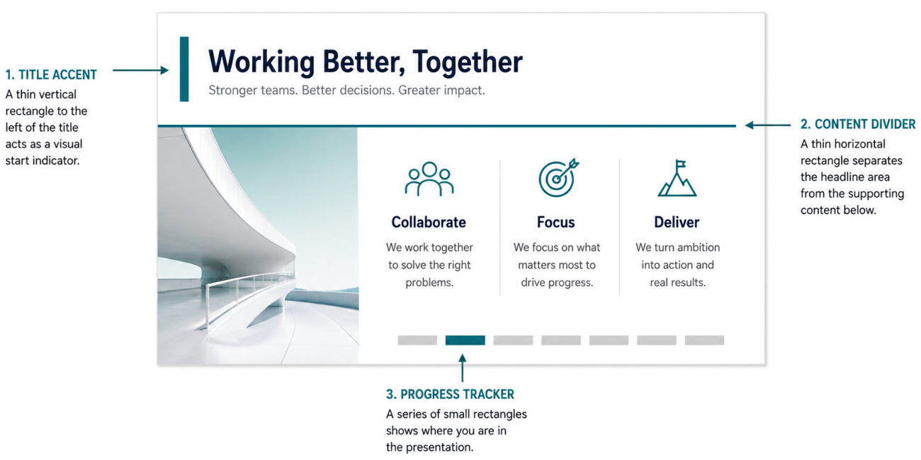
Using rectangles consistently builds brand rhythm . It guides the human eye, telling your audience exactly where to look first. Instead of using heavy, outdated template borders, a minimalist rectangle acts as a modern signature.
Try this:
-
The Title Accent: Place a thin, vertical rectangle to the exact left of your slide title. It acts as a visual "start" indicator for reading.
-
The Content Divider: Use a thin horizontal rectangle (1pt or 2pt height) to separate a high-level quote from the supporting data below it.
-
The Progress Tracker: Create a series of small rectangles at the bottom of your slide master. Colour them grey, but light up one rectangle in your brand colour to show the audience where you are in the agenda.
2. The Text Saver: Overlays and Gradients
We have all been there: you find the perfect, high-resolution background photo. It’s emotional, it’s impactful, and it perfectly matches your topic. But the moment you type your text over it, the words completely vanish into the busy details of the image.
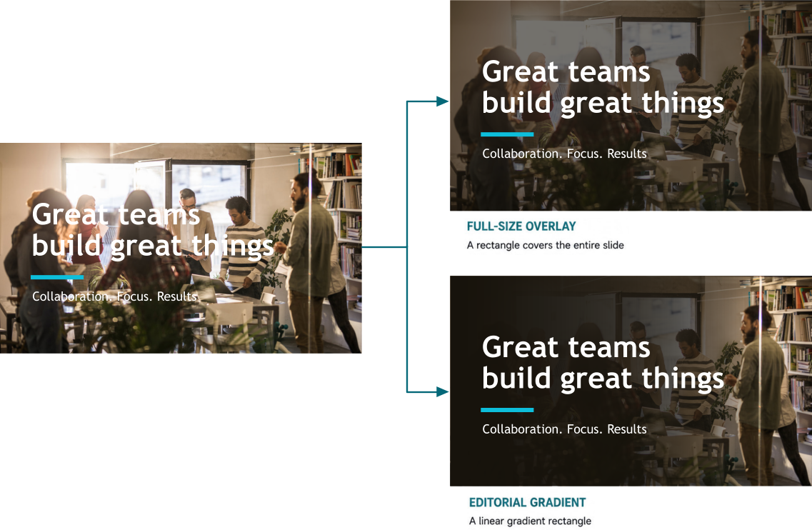
Your instinct might be to change the text colour or add a tacky text shadow. Don’t do it. Use a rectangle instead.
Why it works
This technique provides accessibility and contrast without sacrificing the emotional impact of your photography. It is how Netflix, Apple, and professional editorial magazines display text over imagery.
Try this:
-
The Full-Size Overlay: Draw a rectangle over your entire image. Colour it black or your deep brand colour, and set the transparency to roughly 40%. Send it backward so it sits between the image and your white text.
-
The Editorial Gradient (The Pro Move): Instead of a solid block, right-click the rectangle and go to Format Shape . Choose Gradient Fill . Set the gradient to "Linear". Make both gradient stops the exact same colour (e.g., dark charcoal), but set the transparency of Stop 1 to 0% and Stop 2 to 100%. Position the dark side behind your text, allowing the other side to fade into nothingness, revealing the crisp photo underneath.
3. The Structural Shift: The "Fake" Split Screen
Everyday PowerPoint users often struggle with white space. They either cram everything into the centre of a white slide or stretch a single image to fill the background. You can break out of this layout trap by using a rectangle to cut your slide in half.

Why it works
This creates an instant asymmetrical layout , which naturally mimics premium editorial designs. It breaks the monotony of a long deck, signalling to your audience that this slide contains highly important, distinct information.
Try this:
-
Draw a rectangle that covers exactly half of your slide (either the left or right side).
-
Remove the outline (always remove the outline!).
-
Colour it a rich, contrasting colour from your palette.
-
Place your primary takeaway or a massive statistic inside the coloured rectangle, and put your explanatory context on the plain side.
4. The Magic Trick: Masking with "Merge Shapes"
This is where true graphic design creativity unlocks inside PowerPoint. You do not need Adobe Illustrator or Photoshop to create custom graphics. PowerPoint has a hidden powerhouse tool called Merge Shapes (found under the Shape Format tab when you select more than one object).
Why it works
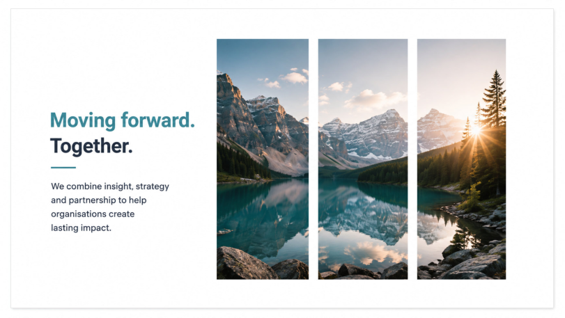
Masking allows you to create bespoke visual assets that look like they were made by a professional design agency. It forces your audience to pause and look closer, boosting engagement.
Try this:
-
Draw three or four long, vertical rectangles next to each other, leaving a small gap between them.
-
Select all of them, go to Shape Format > Merge Shapes > Union . PowerPoint now treats these separate rectangles as one single shape.
-
Insert a stunning image onto your slide.
-
Move your newly unified rectangles shape directly over the image.
-
Crucial Order: Select the Image first, hold Shift, then select the Rectangles .
-
Go to Merge Shapes > Intersect .
Boom. Your image is now perfectly masked inside a custom geometric layout.
5. The Architecture: 3D Extrusion for Custom Columns
PowerPoint’s default charting engine is functional, but it rarely looks "creative." If you want to present data in a way that aligns with a high-end corporate identity, you can build your own bespoke column charts using - you guessed it - rectangles and 3D effects.
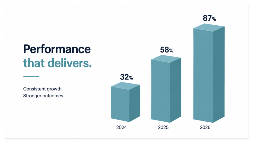
Why it works
Custom 3D columns add depth, premium polish, and architectural structure to data slides. It makes financial or metric-driven slides look intentionally designed rather than auto-generated.
Try this:
-
Draw a standard small rectangle to represent the base of a data bar.
-
Right-click and choose Format Shape , then navigate to the Effects (pentagon) tab.
-
Open 3-D Rotation and select a preset like Off Axis 1 Top or Isometric Top Up .
-
Open 3-D Format . Under Depth , add points (e.g., 50pt or 100pt) until your flat rectangle extrudes into a solid, beautiful 3D block.
-
Duplicate the block, adjust the heights for your different data points, and arrange them side-by-side.
Conclusion: Strip Away the Noise
When you sit down to design your next presentation, I challenge you to close the icon finders, skip the complex smart-art, and ignore the complex polygons. Pick up the rectangle.
See how many different jobs you can make it do. Let it create structure, improve readability, frame imagery, build custom graphics and even visualise your data. When you limit your tools, you force your mind to become truly creative. You don't need to be a professional designer to build breath-taking slides - you just need to master the simple elements right in front of you.
Which of these rectangle techniques are you going to try first in your next deck?
If you want to learn how to unlock more creative design secrets directly inside PowerPoint without needing expensive software, take a look at my PowerPoint - Creative Design course. Let's turn your ideas into visual impact together.
About the Author

Tom Vanhinsbergh
Digital Learning Specialist at Underscore, with a background in graphic design and a passion for visual communication. Tom combines design thinking, storytelling and technical expertise to help professionals communicate ideas more clearly and effectively. Through his training, writing and digital learning work, he shares practical techniques that make everyday business communication more engaging, memorable and impactful.
Need help applying this in your organisation?
We work with HR, L&D teams and business leaders to turn these ideas into practical, instructor-led training that improves day-to-day performance.