How to Make PowerPoint Slides Look More Professional (Using Fly-In Animation)
Most PowerPoint animations don’t look terrible…
They just look a bit… naff.
Things flying in from different directions.
Everything appearing at once.
No real structure.
Everything is technically “there”… but nothing's really working together.
There's no structure. No visual connection. No clear focus.
So people end up just reading instead of listening.
There’s a simple way to fix that.
And it’s not about doing anything complicated…
It’s about making a few deliberate design decisions, then using animation to support them.
What’s Actually Wrong With Most Slides?
A typical slide tends to have:
- Bullet points stacked on top of each other
- A low-quality image dumped wherever it fits
- No use of colour or visual hierarchy
- And often - naff looking Fly-In animations that distract and don’t really add anything
The result?
It feels flat, disconnected, and hard to follow.
What We’re Trying to Create Instead
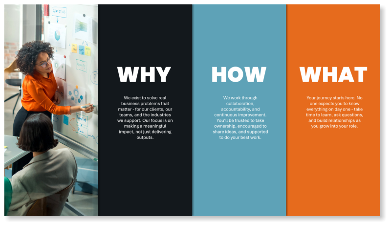
In the improved version of this slide:
- The content is split into three clear ideas
- Each idea has its own space
- Colours are used to create connection and consistency
- The image is integrated into the layout (not just dropped in)
- Animation isn’t removed… it’s used properly.
Each point is revealed intentionally, using Fly-In to guide attention rather than distract from it.
The result is a slide that feels:
- clearer
- more structured
- more professional
- easier to follow
Step-by-Step: Build the Slide
1. Create Your Base Layout
- Go to Insert → Shapes → Rectangle
- Draw your first rectangle
Then:
- Right-click → Format Shape
- Set:
- Line → No line
- Fill → choose a starting colour
2. Duplicate and Align (Right to Left)
- Select the shape
- Hold Ctrl + Shift
- Drag to the left to duplicate
Repeat until you have 4 blocks across the slide.
👉 This keeps everything aligned evenly
👉 Building right to left ensures your layer order works correctly later
3. Scale to Fill the Slide
- Select all shapes
- Press Ctrl + G to group
Now:
- Resize so the shapes fill the full slide edge-to-edge and top-to-bottom
👉 This removes the “floating content” look and makes the slide feel designed.
Then:
- Right-click → Group → Ungroup
4. Use Colour to Create Cohesion
Instead of random colours, use the image to guide you.
For example:
- Pick a colour from clothing in the image
- Pick another from an object (e.g. a notebook or background detail)
- Use a darker neutral to balance it out
👉 This ties the whole slide together visually.
5. Add an Image (Properly)
For the image block:
- Right-click the shape → Format Shape
- Select Fill → Picture or texture fill
- Insert your image
Use a high-resolution image from:
- PowerPoint Stock Images
- Adobe Stock
- Shutterstock
Then adjust the positioning using Format Picture → Crop → Picture Position so the focal point sits well within the shape.
6. Add Subtle Depth
- Select all shapes
- Go to Shape Format → Shape Effects → Shadow
- Choose a subtle shadow (e.g. to the right)
👉 This adds separation and polish.
7. Add and Structure Text
- Go to Insert → Text Box
- Add your content into each block
Keep it tight:
- One idea per block
- Short, clear wording
Then:
- Select each shape + its text
- Press Ctrl + G to group
Use font size and spacing to create clarity.
8. Apply Fly-In Animation (Properly)
There’s nothing worse than slides where things are flying in from all over the place.
This is where most people go wrong with Fly-In.
It’s not the animation that’s the problem…
it’s how it’s applied on top of a poorly structured slide.
It looks messy. Distracting. Amateur.
Like someone’s used every animation just because they can.
More isn’t better.
But used properly, Fly-in is powerful.
Apply the Animation
- Select all grouped blocks
- Go to Animations → Fly In
Set Direction
- Click Effect Options
- Choose:
👉 From Left
Keep it consistent.
Set Timing
- Open Animation Pane
- Set:
- Start → On Click
9. Smooth the Animation
- Select all animated groups
- Right-click → Effect Options
- Increase Smooth End
👉 This removes the jarring stop and makes everything feel more polished.
Why This Works
This isn’t about making slides look fancy.
It’s about making them easier to understand.
You now have:
- Clear structure
- Visual hierarchy
- Thoughtful colour use
- A properly integrated image
- Controlled, consistent animation
Everything works together.
Common Mistakes to Avoid
- Dropping images in without thought
- Using low-quality visuals
- Overusing animation
- Mixing animation styles
- Ignoring layout and structure
The biggest improvements come from:
simple, deliberate design decisions
Taking This Further
For a more advanced example using Morph and 3D models:
👉 How to Use Morph and 3D Models in PowerPoint (Create an Earthrise Animation)
Want to Improve Your PowerPoint and Presentation Skills?
If you’re looking to build these skills more consistently across your team, we run practical, instructor-led courses that focus on both slide design and delivery.
PowerPoint Professional Presentations
Learn how to design clean, professional slides using strong layouts, visuals and slide masters, with purposeful use of animation.
👉 Explore the course
Delivering Presentations with Impact
Build confidence and deliver engaging presentations that hold attention and communicate clearly.
👉 Explore the course
PowerPoint - Creative Design
Create presentations that stand out using practical design principles, visual storytelling and creative PowerPoint techniques.
👉 Explore the course
Whether you’re creating slides or presenting them, the goal is the same… clarity, confidence and impact.
About the Author

Tom Vanhinsbergh
Digital Learning Specialist at Underscore, with a background in graphic design and a focus on creating engaging, practical learning experiences. Tom combines visual design, storytelling and technical expertise to help professionals communicate ideas more clearly and effectively. He works across digital content, training materials and brand, with a particular interest in how visual storytelling can improve understanding, engagement and impact in the workplace.
Need help applying this in your organisation?
We work with HR, L&D teams and business leaders to turn these ideas into practical, instructor-led training that improves day-to-day performance.