
The Power of Pictures: My Journey with Power BI by Susan Howard

In today’s data-driven world, we’re surrounded by numbers — endless spreadsheets, metrics, and dashboards. But data only becomes valuable when it tells a story. That’s where Power BI comes in.
I’ve been using Power BI for many years now, and every time I run training sessions, people are amazed at what it can do. It’s not just a reporting tool — it’s a way to see your data in a whole new light.
Why Power BI Still Reigns Supreme
Let me take you back to my roots — good old Excel. I still love it. Excel is brilliant for calculations, formulas, and quick analysis. But when it comes to helping people truly understand data, Power BI takes things to another level.
They say a picture paints a thousand words — and in the world of analytics, that couldn’t be more accurate. Give me a table full of numbers and I’ll have to work to find meaning. Transform that same data into a gauge, chart, or map, and the message becomes instantly clear.
Imagine you’re tracking your progress toward a sales target. In Excel, that’s a wall of numbers. In Power BI, it’s a dynamic gauge that fills up as you get closer to your goal — visually showing the story of your success.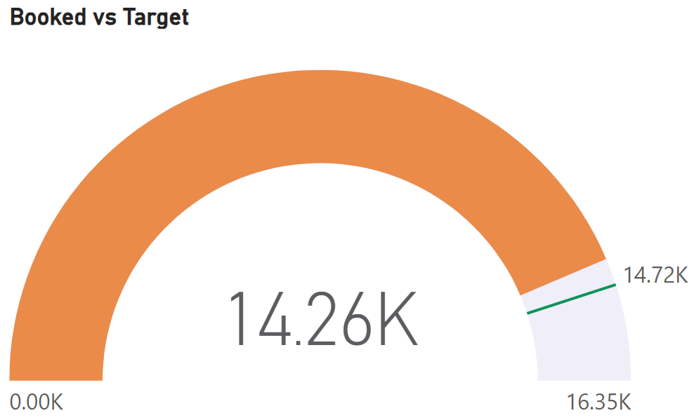
Bringing Data to Life with Maps
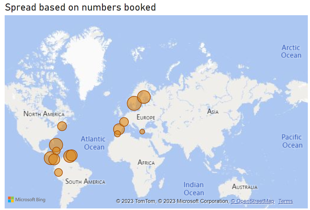
One of my favourite Power BI features is its ability to visualise geographical data. Whether you’re tracking sales across regions, mapping customer locations, or analysing shipment routes, Power BI’s mapping visuals bring global patterns to life.
I’ve seen clients use this to track equipment across continents, identify customer concentrations, and even spot delivery bottlenecks. Seeing your business world plotted on an interactive map changes how you think about it — instantly.
Designing Your Own Data Style
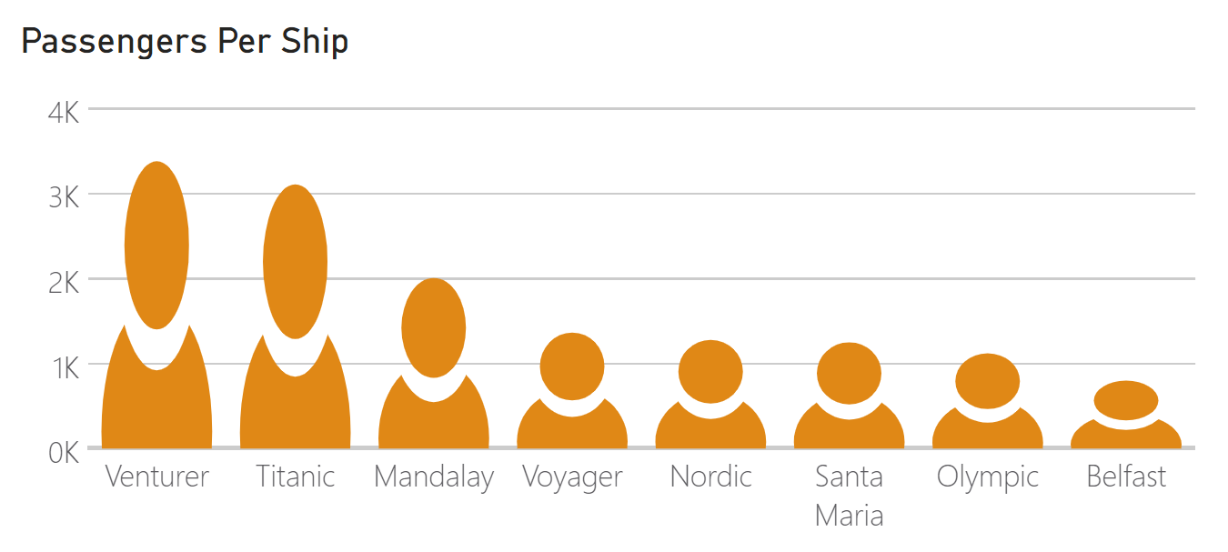
Another reason I love Power BI is its creative flexibility. You’re not limited to standard bar or pie charts — you can download custom visuals to make your data more engaging and relevant.
For example, if you’re presenting logistics data, why not use icons of lorries instead of bars? Or for a presentation about passenger numbers, replace the bars with silhouettes of people. These visual tweaks make your reports not just informative, but memorable — and tailored to your audience.
Power BI’s custom visuals let you make your data truly your own. It’s about more than analysis; it’s about communication.
Always Evolving: The Power of Progress
One of the things that’s impressed me most over the years is how Power BI continues to evolve. It’s not a static tool you learn once — it grows with you.
When I first started, Power BI already felt revolutionary. But each update since then has added smarter features that respond directly to what users need — from new connectors to AI-driven insights and Copilot.
Today, you can even use natural language to ask questions about your data or generate visuals automatically. It’s like having a data assistant built in — helping you create faster, cleaner, and more dynamic reports.
Take Your Power BI Skills Further
Whether you’re new to Power BI or ready to deepen your reporting and analysis, our range of courses will help you build confidence and capability across every level.
Power BI – Introduction
If you’re just getting started, this course gives you the foundation you need to work confidently with Power BI. You’ll learn how to:
- Import and cleanse data from multiple sources to prepare accurate reports
- Build and format a range of visuals including charts, tables, cards, maps, and gauges
- Use slicers and filters to explore data interactively
- Connect data from different systems to create unified dashboards
Power BI – Advanced Reporting
Designed for experienced users who want to take their reporting to the next level. You’ll explore:
- Fiscal reporting: aligning visuals with your company’s financial year for clearer, more relevant comparisons
- Enhanced visual reporting: using drill-throughs, slicers, action buttons, and custom tooltips to create interactive experiences
Power BI – DAX Calculations and Measures
This course helps you unlock the full analytical power of Power BI using DAX (Data Analysis Expressions). You’ll learn how to:
- Create calculated columns and measures that turn raw data into meaningful insights
- Use time-intelligence functions for year-to-date, month-on-month, and comparative analysis
- Build conditional measures that respond dynamically to slicers and filters
All three courses are part of our Systems & Office Applications Training Catalogue, with virtual and onsite delivery available for individuals and teams.
📘 Explore our Systems & Office Applications Training Catalogue
📅 View our upcoming Public Training Programme dates
📧 [email protected]or [email protected]
📞 +44 (0)20 8152 6551
Wrapping It Up
Data has stories to tell — and with Power BI, those stories finally come to life. Over the years, I’ve seen how visualising data transforms understanding, decisions, and confidence.
If you’re curious about how Power BI could work for you or your organisation, I’d love to chat.
I’m Susan Howard, and I’m passionate about helping people unlock the power of their data through training that’s practical, engaging, and built around real-world needs.
Let’s make your numbers tell a story.
About the Author

Susan Howard
IT Training Specialist and Facilitator with deep expertise in Microsoft Office applications, Power BI, and business systems. As Technical Training Lead at Underscore, Susan delivers engaging, hands-on courses that help professionals boost productivity, improve data confidence, and master essential digital skills across Excel, PowerPoint, Outlook, and more.
Need help applying this in your organisation?
We work with HR, L&D teams and business leaders to turn these ideas into practical, instructor-led training that improves day-to-day performance.